TL;DR

Get home appliances delivered free with Prime
- Fast, free delivery on millions of items
- Prime Video, Amazon Music and more included
- Member-only deals all year
Livingetc’s Style Pulse report for spring/summer 2027 identifies mint green as an emerging interior color, following its appearance in recent fashion collections and at Milan Design Week. Designers quoted in the report describe it as fresh and energetic, and suggest using it in measured doses with earth tones, deeper colors or warm accents.
Mint green is emerging as an interior color for spring/summer 2027, according to Livingetc’s Style Pulse trend report, which points to the shade’s recent presence in design and fashion and to designers’ use of color in homes. The report presents mint as an alternative to olive and sage greens, and recommends introducing it selectively rather than using it throughout an interior.
Livingetc describes mint as an “oxygenated green” that sits between natural references and a futuristic, digital aesthetic. Color expert Amy Moorea Wong links that impression to mid-century space-age design as well as contemporary screens and app culture. She says the light pastel shade approaches neon without the intensity of fluorescent color, giving it visual impact while remaining usable in interiors.
The report also cites Livingetc editor Hugh Metcalf, who said he saw the color repeatedly at Milan Design Week. He described mint as disruptive enough to make a scheme feel alive, but soft enough to avoid the harsh contrast associated with more acidic greens. The report does not give a count of appearances or identify a single event or collection as the cause of the trend.
Mint has also appeared in recent runway collections, according to the report: Fendi’s Spring/Summer 2026 collection, Matthieu Blazy’s first drop for Chanel, and Loewe’s 2027 spring ready-to-wear show. Those fashion examples provide cultural context for the interior forecast, rather than evidence that households are already adopting the color at a particular rate.
A Fresh Accent, Not a Full Palette
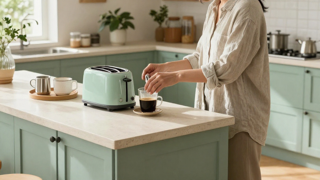
The forecast outlines one way designers may use color in the coming season: mint can serve as a focal point without requiring an entire room to be painted in a bright shade. Designers quoted in the report describe it as an accent in otherwise restrained interiors, an approach that allows for color without a full-room scheme.
Paris-based designer Samantha Hauvette, of Hauvette & Madani, says mint feels optimistic and has a connection to modernist design. Discussing an armchair in a project featured by Livingetc, she describes the color as a punctuation mark that brings energy and connects with turquoise elsewhere in the apartment. Chicago designer Jennifer Sucher says she balanced mint with burgundy plaster art, using the darker tone to make the wall color feel more sophisticated.
These are examples and professional opinions, not a promise that mint will suit every space. Their common thread is contrast and restraint: the color can stand out when surrounded by earth tones, muted deep colors, pinks or terracotta. The examples include limited applications such as a lamp, chair, ceiling or other part of a room.
Products Worth Considering

Bose Lifestyle Ultra Wireless Home Speaker

Bose TV Speaker Compact Soundbar with Bluetooth and HDMI-ARC, Black

Levoit Core 400S-P Smart Air Purifier for Large Rooms
As an affiliate, we earn on qualifying purchases.
From Runways to Living Rooms
The report places mint within a cycle in which particular shades of green move in and out of focus. Livingetc says olives and sages are currently prominent and casts mint as a shade gaining attention. It connects that shift to appearances in fashion collections and at Milan Design Week, as well as examples from residential projects. These references illustrate the report’s reasoning, but do not establish a measured change in sales, search activity or professional adoption.
Designers quoted by Livingetc offer different ways to interpret the shade. Color consultant Harriet Slaughter says mint can evoke the 1930s to 1950s and suit bathrooms, kitchens and other bright spaces. Sucher says interest may reflect a broader readiness among clients to use color, while describing mint specifically as fresh and unexpected. The article offers these observations as expert perspectives, not as findings from a consumer survey.
For application, Wong suggests testing colors on the red side of the color wheel, including rust, rosy pink and cherry. Australian designer Jonathan Richards says a mint ceiling in an Art Deco building was informed both by the property’s heritage and by the surrounding pink and terracotta tones. Together, the examples show how the forecast’s appeal depends on a room’s existing materials and colors.
““Mint is so futuristic because it’s wrapped up in the mid-century space-age palette, as well as contemporary tech, screen, and app culture.””
— Amy Moorea Wong, color expert, quoted by Livingetc
Forecast, Not Measured Demand
The report is a seasonal trend forecast, not a market study. It does not provide sales figures, consumer polling, search data or a quantified comparison showing how much mint is gaining ground against other colors. Its evidence consists of editorial observations, runway references and designers’ accounts of individual projects.
It is also unclear how broadly the shade will be used across homes in 2027, whether it will remain a small accent or expand into larger surfaces, and which specific mint tones will prove most popular. The examples in the report show possible applications, not a guarantee that the color will become a lasting or widely adopted interior standard.
Watch for SS27 Applications
As the spring/summer 2027 season approaches, further design collections and residential projects may show whether mint moves beyond editorial forecasts and isolated examples. Livingetc’s Style Pulse report presents the shade as one direction to watch, while the designers’ advice points readers toward testing it in small areas and alongside existing colors before making a larger commitment.
Further evidence would include how frequently the color appears in completed interiors and product ranges, and whether designers continue to pair it with warm or deep tones. Until such evidence is available, mint green is best understood as a reported emerging trend, not an established measure of what most homeowners are choosing.
Key Questions
What interior color trend does Livingetc identify for SS27?
Livingetc’s Style Pulse forecast identifies mint green as an emerging interior color for spring/summer 2027, contrasting it with the olives and sages the report says are prominent now.
How do designers suggest using mint green at home?
The designers quoted recommend using mint selectively, such as on an armchair, lamp, ceiling or wall, and balancing it with earth tones, muted deep colors or warmer shades.
Which colors does the report suggest pairing with mint?
Amy Moorea Wong suggests testing rust, rosy pink and cherry. Other examples in the report include burgundy, turquoise and terracotta.
Does the report show that mint green is already widely adopted?
No. It is a trend forecast based on editorial observations, fashion appearances and designers’ comments. It does not include sales data or a survey measuring how widely homeowners use mint.
Source: livingetc.com