
TL;DR

Get home appliances delivered free with Prime
- Fast, free delivery on millions of items
- Prime Video, Amazon Music and more included
- Member-only deals all year
A House Beautiful report asked interior designers which paint choices they would avoid for living rooms. Their answers focused less on one forbidden color and more on how undertones, lighting, room size and finish can affect a space; the designers also stressed that personal preferences and accents matter.
House Beautiful asked interior designers which colors they would avoid painting in a living room, and the responses did not identify one universally unsuitable hue. Instead, designers pointed to green-yellow undertones, stark cool grays and whites, expansive bright-red walls, and high-sheen finishes as choices that can be difficult in some rooms, depending on light, scale and the atmosphere a homeowner wants.
Interior designer Meghan Shadrick said living rooms often benefit from light, balanced neutrals because they leave room for bolder colors or wallpaper elsewhere. She cautioned that green paint with strong yellow undertones can shift under artificial light at night, making the color appear more yellow and, in her view, less appealing. Her advice is about a particular undertone and lighting effect, not a claim that green itself should be avoided.
Brooke Mennen-Talsma, principal designer at Brooke MT Interiors, said cool grays can appear overly stark or flat, while some whites can have a similar effect. She favors muted, earthy colors for a more collected, lived-in feeling. Shadrick also said bright reds can feel overwhelming across large areas, though she uses red as an accent or in smaller rooms such as studies.
Designer Blair Burton described a different concern: making a client’s favorite color the living room’s dominant backdrop may limit how other elements work with it. She suggested bringing that color in through textiles, furniture, art, rugs or pillows instead. Mennen-Talsma and Burton also favored low-sheen wall finishes, which they said create a softer appearance and draw less attention to surface imperfections; the report says a little more sheen can be used on trim or millwork.
How Paint Choices Shape a Living Room
The report’s practical point is that a paint color cannot be judged in isolation. Natural and artificial light, undertones, the size of the painted area and the wall finish can all affect how a room feels. A hue that looks balanced on a small sample or in daylight may read differently across an entire room after dark.
That matters because living rooms are often used for relaxing and spending time with others, and walls make up a large visual backdrop. The designers’ comments offer homeowners a way to think through paint decisions before committing: test colors in the room’s actual lighting, consider whether a saturated shade works better as an accent, and weigh finish as well as color. These are professional preferences, not rules that establish a color as wrong for every home.
As an affiliate, we earn on qualifying purchases.
The Designers’ Advice by Color
The source report frames its recommendations as designers’ individual judgments rather than a definitive list of colors that should never be used. Shadrick’s comments distinguish green from especially warm, yellow-leaning greens, and bright red from red used selectively or in a small, cozy room. Mennen-Talsma’s criticism concerns cool, stark grays and whites, not every neutral.
Burton’s suggestion also shifts the question from which color to choose to how prominently to use it. A homeowner can retain a favorite hue without making it the dominant wall color, using it in several materials or objects instead. The report similarly treats sheen as a design choice: lower sheen on walls, with potentially more sheen on trim, rather than a ban on glossy finishes everywhere.
“In the evening, artificial light is the only light source, and light bulbs tend to turn green-yellows even more yellow and almost always go putrid in tone.”
— Meghan Shadrick, interior designer, as quoted by House Beautiful
neutral wall paint for living rooms
As an affiliate, we earn on qualifying purchases.
As an affiliate, we earn on qualifying purchases.
No Color Is Ruled Out Universally
The report does not establish that any color is unsuitable for every living room. Its recommendations reflect the designers’ experience and preferences, and the source provides no controlled comparisons of how particular paints perform across different rooms, lighting conditions or wall surfaces. It also does not name specific paint products, undertone measurements or sheen levels.
The effect of a color can vary with a room’s orientation, bulbs, furnishings and the homeowner’s taste. The report’s supplied text does not include reactions from paint manufacturers or a broader survey of designers, so its advice should be read as a set of design considerations rather than a consensus standard.
light gray wall paint for living rooms
As an affiliate, we earn on qualifying purchases.
As an affiliate, we earn on qualifying purchases.
Test Samples in the Room
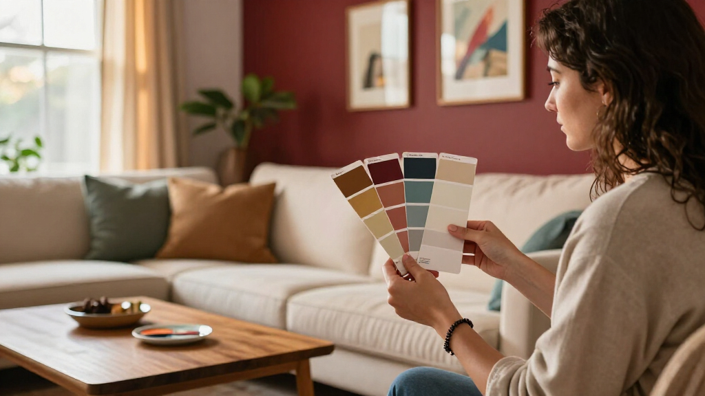
The report does not announce a follow-up study or a next milestone. For readers weighing a repaint, the designers’ advice points to a practical next step: sample the paint on the intended walls and view it at different times of day, including under the room’s usual evening lighting. Consider the undertone, the amount of wall being covered and whether a favorite or bold color might work better in furnishings or accents.
Homeowners can also compare wall finishes in place before selecting one, particularly if surface imperfections are a concern. The final choice remains specific to the room and the person using it; the source offers guidance, not a universal prohibition.
paint color tester kit for living rooms
As an affiliate, we earn on qualifying purchases.
As an affiliate, we earn on qualifying purchases.
Key Questions
Is there one color designers say never to use in a living room?
No. The House Beautiful report presents designers’ preferences and cautions, not a universal ban. Several comments focus on how a color behaves in a particular room or when used over a large area.
Why did one designer caution against green-yellow paint?
Meghan Shadrick said that artificial evening light can make yellow undertones look stronger, changing the appearance of green paint. Her concern was specifically about green-yellow hues, not all greens.
Can bright red work in a living room?
Shadrick said red can feel overwhelming on large painted areas, but she uses it as an accent and in smaller, cozy rooms. The report does not say that red should never be used.
What wall finish did the designers prefer?
Brooke Mennen-Talsma and Blair Burton favored lower-sheen finishes on living room walls for a softer appearance and less emphasis on imperfections. The report says trim or millwork can take a somewhat higher sheen.
Source: rss
Cold & flu season Picks
humidifiers
As an affiliate, we earn on qualifying purchases.